Description
In this course, you will :
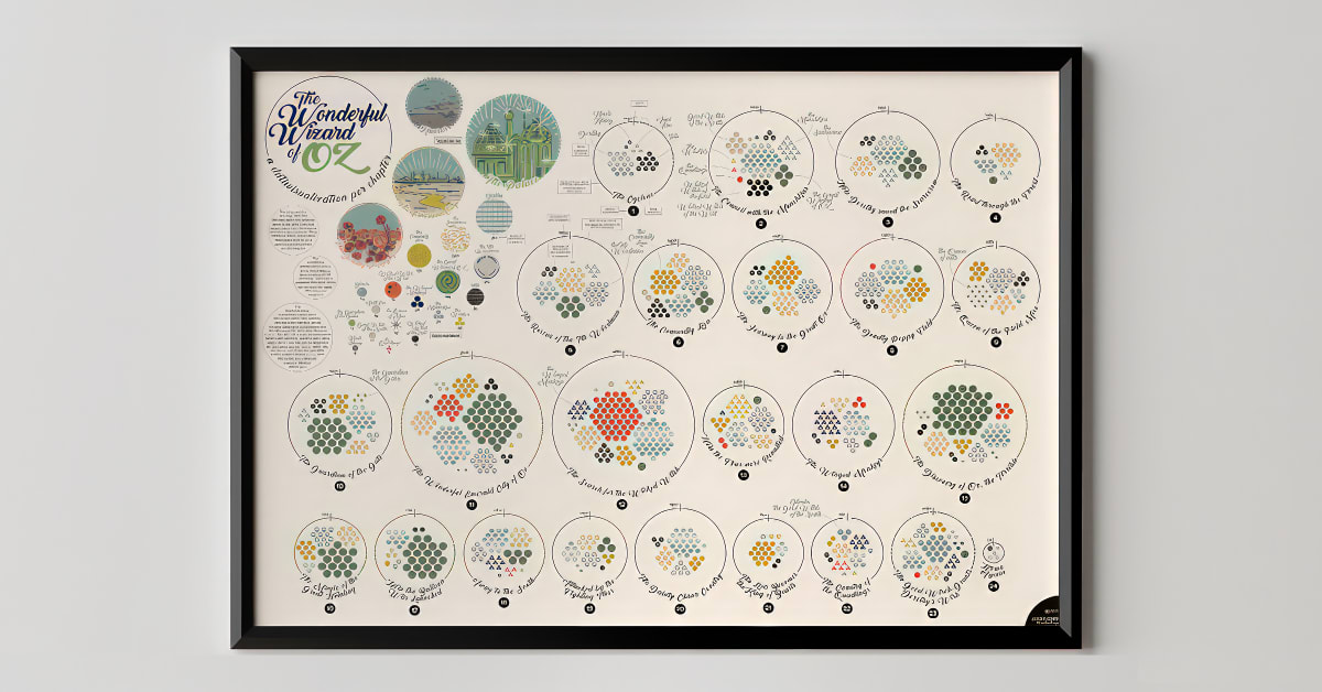
- Learn how to look for a topic to translate into a data illustration.
- explains the significance of developing an emotional attachment to your chosen topic before delving into how to find and harvest data in Excel in preparation for your visualisation
- Start by sketching your ideas and experimenting with colours, shapes, and layout.
- walks you through her design process in Adobe Illustrator before demonstrating how to incorporate graphs from Excel. Then, to support your data design, add annotations and a title.
- Learn how to solicit feedback on your work to ensure that your audience understands it. Then, before learning how to share your work with the rest of the world, make any final adjustments.
Syllabus :
1. Data and Emotional Subject
- The Subject of Your Visualization
- Looking for Data
- Harvesting the Data
- The ‘Data’ for Your Visualization
2. Creating a Poster
- Sketching and Storyline
- Method and Colours
- Workflow
- Incorporating the Elements into Your Design
- Title and Explanation
3. Finishing and Sharing Your Work
- Feedback and Final Edits
- Sharing Your Work


