Description
In this course, you will :
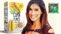
- Photorealistic product packaging for a cereal box and a healthy snack-bar label was created. Use what you've learned to create your own packaging designs.
- As you are introduced to insightful design theories based on font psychology, history, and consumer behaviour, you will be able to communicate more effectively within teams or even during an interview.
- My hands-on workshop teaching method will help you to expand your creativity. Working alongside me, you will learn a wide range of Photoshop and Illustrator tools and techniques.
- Discover how to create a distressed texture using various techniques. Use this to make a weathered-looking logo.
- A graphic designer's roles and responsibilities in the competitive business and entrepreneurial startup world.
- Understand how to design for a target market by having knowledge of graphic design based on current research and statistical experiments.
- Capable of maturing into an intelligent designer who understands how to apply design theory to combine art, creativity, reasoning, and logic in order to create marketable designs.
- Have a more mature understanding of graphic design in today's world rather than simply knowing how to make brochures and business cards without any appreciation of 'what is graphic design' - that's too old school.
Syllabus :
1. Designing A Cereal Box. Focus On 'How To Choose A Font' For Your Market
- What you will create by the end of this Chapter!
- Create & Setup Your First Photoshop File
- Resources. How To Source & Install The Font Bellaboo, Needed For This Design.
- Compose the layout of the Cereal Box By using Guidelines
- A little joke when dealing with clients. A Common Mistake With Target Audiences
- Remove The Background From An Image
- Add images to cereal box design
- Add Text To Front of Cereal Box
- Set Up The Layout For The Side Panel of Cereal Box
- Add Images To Side Of Cereal Box
- Photorealistic Product Mockup of Cereal Box
2. How To Choose A Font And How Impressions Are Created By Fonts.
- Why bother about fonts & impressions?
- Think Like A Graphic Designer
- Guidelines to help you choose appropriate fonts.
- What impressions can be created with typeface?
- Disney Font Explained. Why Is It Appropriate For Kids Movies?
- Breakdown of Responses From The Canon's Logo & Font. Is It Engaging? Why?
- What Makes a Font 'Feel' Unsettling? Case study Explaining The Theory of A Logo.
3. Composition: Use The Rule Of Thirds To Create A Photorealistic Snack-bar.
- The Concept of the Rule of Thirds. An Overview Of How To Construct The Grid.
- Step by Step tutorial to create a Snack Bar in Photoshop
- Step by Step tutorial to create a Snack Bar in Photoshop
- Use the Pen Tool To Draw the Purple Block In The Lower Third Region
- Insert Text Onto The Snackbar Design
- Insert Almond Images To Snack Bar Design
- Transform The Label Into A Photorealistic Product Mockup
