Description
In this course, you will :
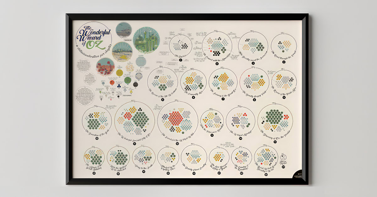
- Dive into the vast field of data visualisation to discover its role and potential. Federica contextualises the delicate relationship between information design and its audience by using her projects as visual aids.
- When confronted with information about unfamiliar topics, learn the value of collaboration.
- Learn how to find official and trustworthy sources, as well as how to select data that tells the stories you want to tell.
- Create a dataset in Google Sheets and investigate the crucial transition from an information table to a visual representation.
- Federica explains how she finds visual inspiration to create an engaging piece that communicates multiple layers of information seamlessly.
- Learn how to use design software like RAWGraphs and Adobe Illustrator to create key elements like legends and visual guides that make reading easier.
Syllabus :
1. About Data Visualization
- Collaboration
- The Relationship with the Readers
- The Broad Field of Data Visualization: Readers and Usage Context
- Designing Visual Alphabets
2. Setting the Project in Motion
- From Google Sheets to the Paper
- The Data
- Finding the Data: The Sources
3. Visualizing the Data
- Visual Inspiration
- Designing the Skeleton with RAWGraphs
- Editing with Adobe Illustrator
- Adobe Illustrator
- Always Keeping in Mind the Readers: Legends and Feedback
- Finishing the Job


