Description
In this course, you will :
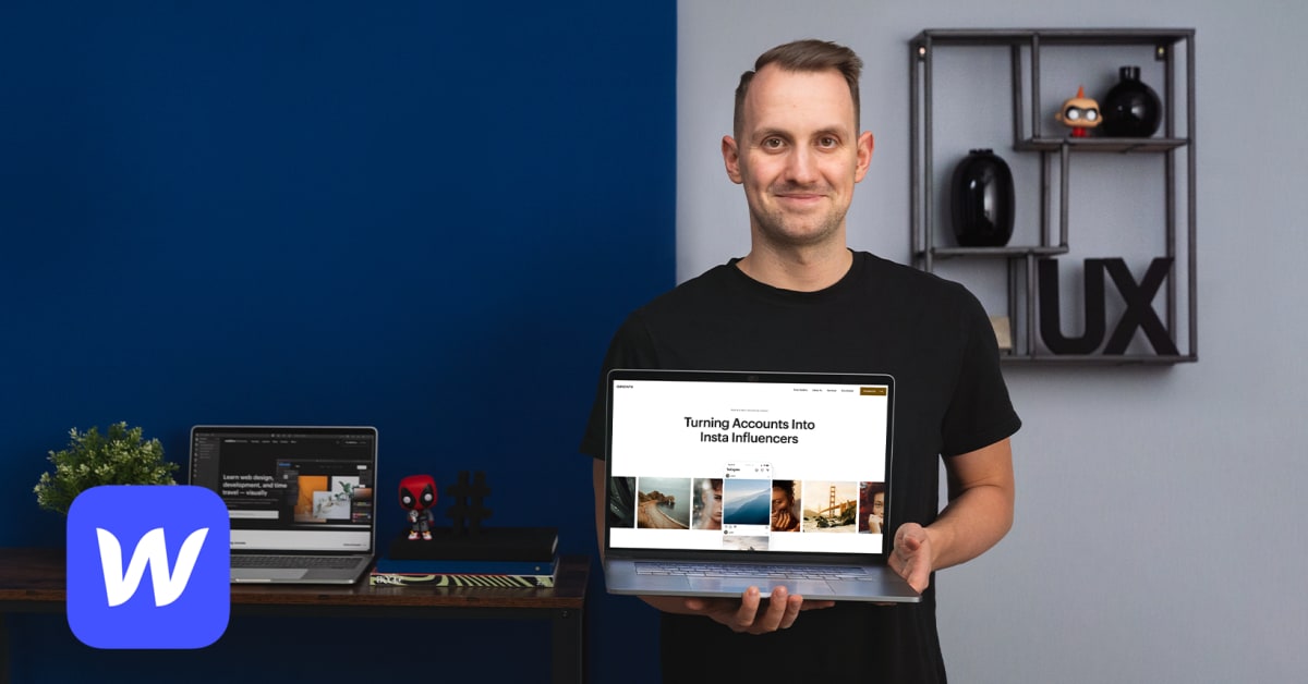
- Learn about no-code development before diving into Webflow's key features and where to find royalty-free images. Then, create a style guide that includes all of your design's main elements, from colours and fonts to buttons and typography.
- Create a desktop version of your site, beginning with the hero section. The navigation menu, case studies, and collage elements will follow. Examine how forms are built and include a "work with me" section before creating a footer with a clear call to action.
- It's time to make your website mobile-friendly. Begin with the tablet view before progressing to the mobile and portrait formats. Forms should be tested, interactive elements should be added to your website, and the difference between "page load" and "scroll in view" should be investigated.
- Proceed to the site's final details. Investigate SEO tags and website hosting. Then consider website maintenance and third-party editing access. Jan concludes the course by walking you through Webflow CMS and its capabilities.
Syllabus :
1. Webflow, No-Code Overview and Style Guide Creation
- Introduction to No-Code
- Webflow Core Features
- Design
- Style Guide
- Style Guide Creation
2. Developing the Desktop Version
- Hero Section
- Navigation
- Case Study Sections
- Collage Section
- Customers Section and Simple Newsletter Form
- Footer
3. Developing the Responsive Website
- Tablet Viewport
- Mobile Landscape and Portrait Viewport
- Testing Forms
- Interactions
4. Final Detailing, Going Live and Future Maintenance
- SEO Optimization and Hosting
- Maintenance, Editor and Assets Panel
- Explore CMS
