 Share
Share Description
In this course, you will learn:
- How to build dynamic, responsive single-page designs with HTML, JavaScript, and CSS.
- How to use HTML, jQuery, and CSS to build your own dynamic, deeply responsive designs.
- how to add the features that make single-page designs so great, with these four frameworks:
- Compass, whose Sass mixins help you leverage CSS3 features like Flexbox.
- Susy 2, the framework that "subtracts" the math from responsive grid design.
- ScrollMagic, for adding "magical" scroll effects
- Breakpoint, which makes writing media queries in Sass a snap
Syllabus:
- Introduction
- What you should know before watching this course
- Using the exercise files
1. Getting Started
- Analyzing our project
- Installing Git and Node on a Mac
- Installing Git and Node on a PC
- Installing and updating Ruby
- Downloading dependencies
- Analyzing our workflow
- Examining your HTML
2. Organizing Your Sass
- Working with Github templates
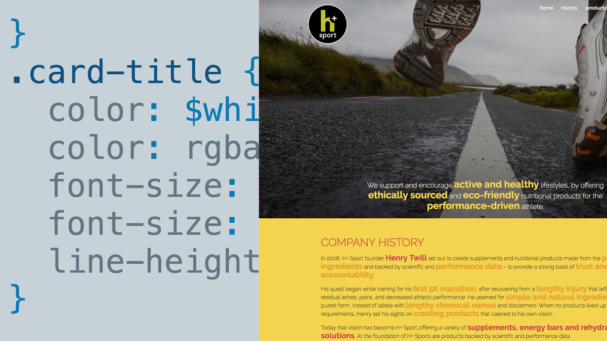
- Organizing your Sass
- Preparing your variables
- Creating basic styles
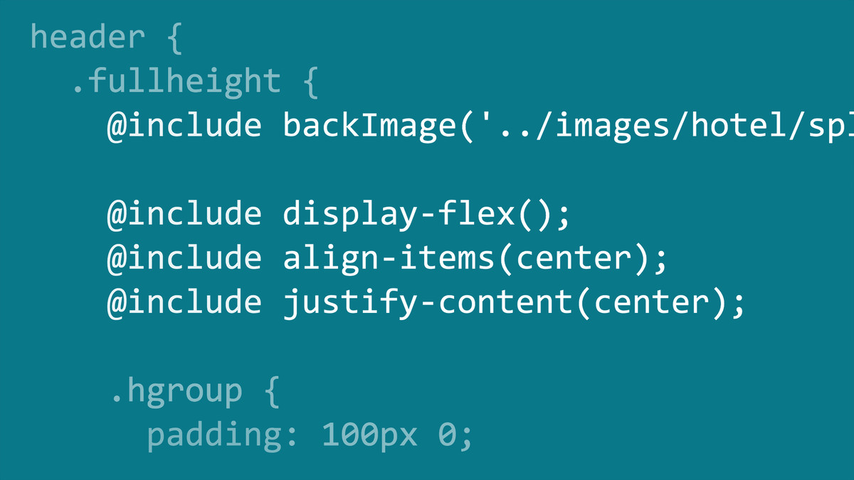
- Building your own mixins
- Preparing your header
- Coding the navigation
3. Creating Responsive Grids with Susy
- Making your navigation responsive
- Controlling media queries with Breakpoint
- Using the Susy Gallery mixin
- Designing a complex layout
- Adjusting your layouts
- Padding elements with Susy
- Using jQuery for full screen and Compass flexbox features
- Creating media queries outside your elements
- Adding defaults to your background mixing
- Using a split layout
- Finishing your layouts
- Adding a footer
4. Animating Your Layouts
- Creating a tween animation
- Pinning your navigation and smoothing scrolling
- Highlighting menu items on scroll
- Controlling scenes by scrolling
- Adjusting for touch devices
- Deploying to production

