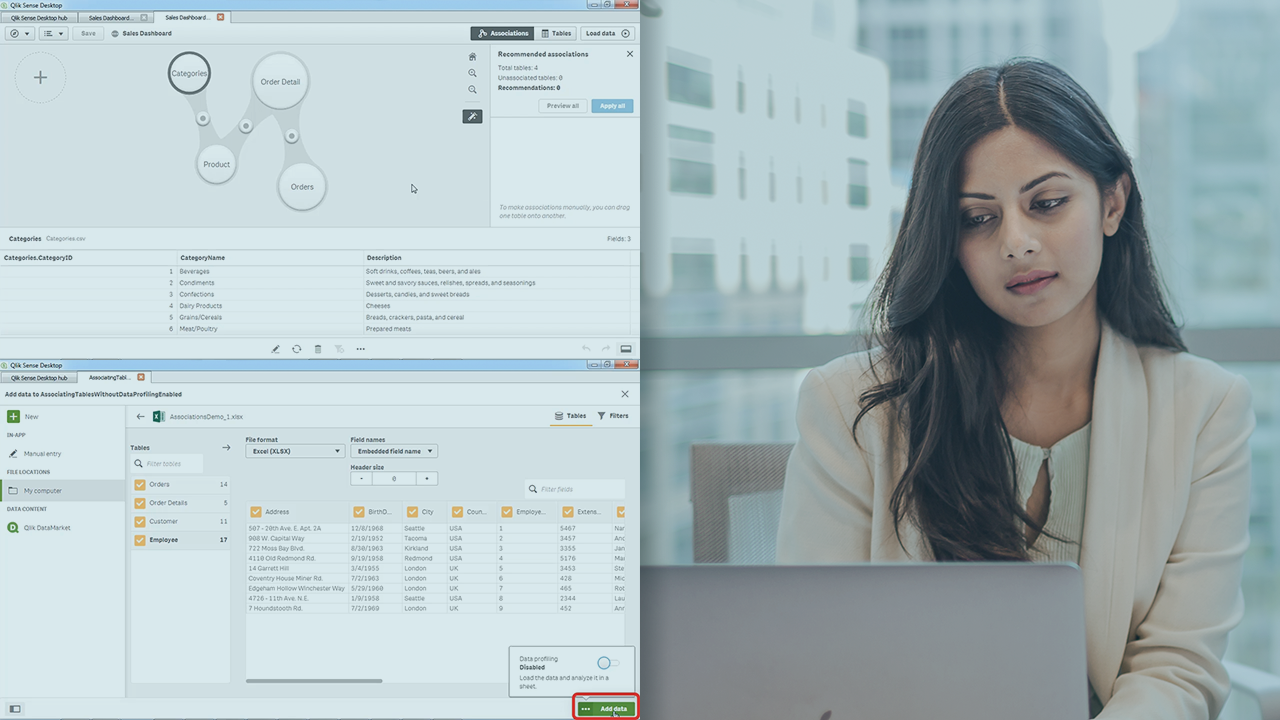
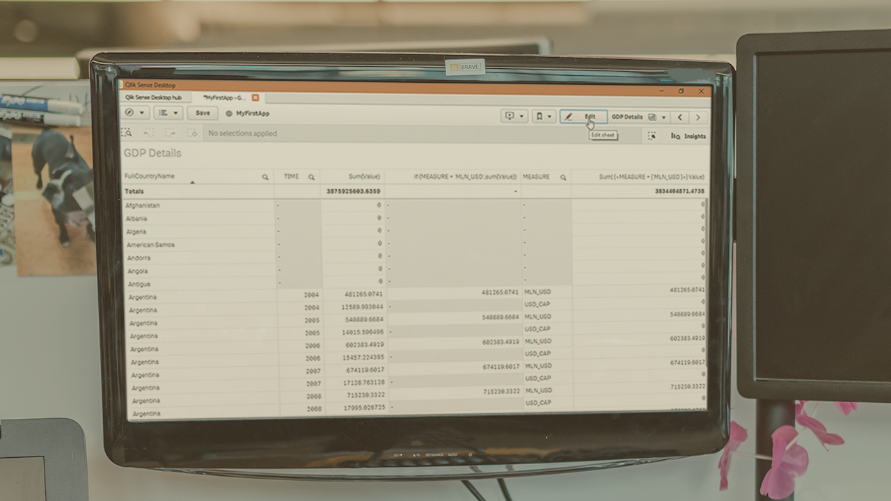
Description
In this course, you will learn:
- How to analyze and display data using this powerful platform.
- How to create and manipulate a variety of data visualizations, from bar charts to histogram charts; create PivotTables and reports; sort and filter data; and combine your app's sheets with objects, text, and images to create a story that clearly conveys your message.
Syllabus:
1. Introducing Qlik Sense and QlikView
- Connect to Qlik Sense
- Qlik Sense user interface
- View available data sources
- Get help in Qlik Sense
2. Manage Data Sources and Tables
- Source
- Join related data sources
- Join data sources with different field names
- Create a table and add fields
- Change table field summary operations
- Change table field number formatting
- Add, reorder, and delete table fields
- Move, resize, and delete a table
3. Manage Qlik Sense Sheets
- Add, duplicate, and rename sheets
- Reorder, clear, and delete sheets
- Change the appearance of a sheet tab
- Edit and align sheet objects
- View sheets and define bookmarks
- Change sheet object properties
- Print a sheet
- Copy a sheet to an image file or the clipboard
- Export Qlik Sense data to Excel
4. Create Charts for General Data
- Create a bar chart
- Create a line chart
- Create a pie chart
- Create a scatter plot chart
- Create a box plot chart
- Create a histogram chart
- Create a combo chart
- Format a chart
5. Create Charts, Text, and Images for Dashboards
- Create a gauge chart
- Create a treemap chart
- Create a distribution plot chart
- Create a map chart
- Define a KPI
- Create a waterfall chart
- Add a text box to a sheet
- Add an image to a sheet
6. Create PivotTables and Reports
- Create a PivotTable
- Manipulate a PivotTable
- Change PivotTable summaries
- Create a custom calculation
7. Sort and Filter Data
- Sort table data
- Sort chart data
- Filter chart and table data
- Filter all objects on a sheet
- Create a story
- Add and remove story elements
- Navigate through a story


